Welfare and Lying with Statistics
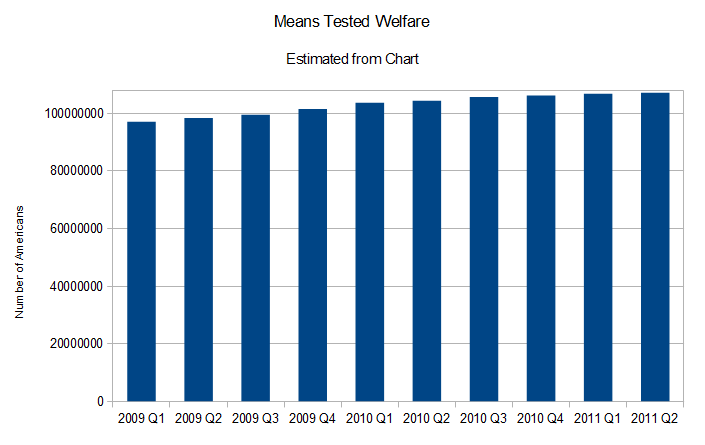
On Facebook, I ran across a graphic posted by “Things Liberals Hate” and shared by a Facebook friend. (The “share” apparently no longer exists in my friend’s thread, a few minutes after posting a link to my criticism to the thread. However, The Weekly Standard shows the original graphic.) It shows a bar graph of increasing numbers of Americans accepting some form of “federal welfare”. Beyond the terms of art in the original graphic, it has an immediate impact of implying that maybe 4x the number of people on welfare in 2009 Q1 were on welfare come 2011 Q2. That is, until one pays closer attention to the range of values on the Y axis. The range is from 94 million to 108 million. This gambit is a classic and is prominently featured in the also-classic book, Darrell Huff’s “How to Lie with Statistics”. Here’s a version of the original graphic I made using the same Y-axis range.

In order to illustrate how the numbers ought to be presented, I estimated the values out of the original graphic (with the help of a business card as a straight-edge), popped those into a spreadsheet, then graphed them with a Y-axis range of 0 to 108 million. I’ve re-graphed the points with the full Y-axis range. One can see that there is far less drama in the graph that shows the actual full range of numbers. Accepting for the sake of argument that 2011 Q2 number represents 0.33x the USA population, there is an approximate 3.1% increase in welfare recipients over the period in the graph, not the 4x visual increase suggested by the original graph. That’s actually pretty darn good, given just how awful the Bush(2) recession is.

Love it. I haven’t seen that particular graph on my GOP friend’s feed yet, but I suspect I will soon.
The caption on the original graphic says that the figure is for people residing in a household where at least one person receives welfare, I guess this would inflate the numbers quite a bit.
Soren,
Yes, it is a lot like the IDC “metric” of genetic distance that I discussed here a while back.
There’s also the possibility that people receiving money from two or more means-tested programs were counted twice.
Let’s say that you’ve got a population of 100 people. You define ten groups within that population, each with ten people. Let’s say ten people receive aid from Program A. That would be 10% of your population. But you report this by “groups affected” instead of individuals. There’s only one distribution that yields a 10% figure, and that is if all ten Program A recipients happen to also comprise one group. If nine are in Group 1 and one is in Group 2, you get 20% by “groups affected”. If there is a Poisson-like distribution (5,3,1), you’d get 30%. If it were a Gaussian distribution (1,2,4,2,1), you’d get 50%. And a uniform distribution could yield a figure of 60% or more.
Sticking with the population and groups defined above, let’s say that five individuals receive aid from Program A and five individuals receive aid from Program B. The 10% of individuals number would only apply if Program A recipients never got aid from Program B. If there were 40% overlap between the two programs, two individuals getting aid from Program A also get aid from Program B, and the total number of individuals receiving aid is just 8 instead of 10. Unless that association is tracked (and a cursory look at the SIPP website makes me think that it is more likely not to be, at least in the summary data), though, the groups that the double-dippers belong to would get counted twice. The graphic claims to combine eighty means-tested programs as being “welfare”, and that has the potential to drastically inflate the number reported via the grouping metric.
I put in a comment at the Huffington Post in response to someone citing the number from the graphic:
I had to enter another comment at HuffPost.
I saw the original graph in the Weekly Standard, and immediately concluded that over the period the graph covers, the numbers have increased by 10 million, from about 97 million to about 107 million.
To me that looks like about a 10% increase in the numbers, and numbers is what the original article talked about.
BTW, I was not misled by the graph, never crossed my mind that somebody might be trying to mislead me, just as your claim that the percentage only grew by 3.1@, correct as it is as a percentage of the total population in the US, is not misleading me into thinking that 10 million more people in this category is less of a big deal than I first thought. If the original graph tried to exaggerate things, didn’t you try to exaggerate just as much in the opposite direction?
Henry,
The graph I worked from (which is an elaboration on the one in the Weekly Standard link, and is recorded in a Facebook wall post of mine) claimed 33% of Americans were on welfare. That’s a percentage of the total population. I used the same referent in my response.
I’ll accept your apology in advance.
The graph as used by “Things Liberals Hate” is included in the top part of my Facebook Wall Photo, in case anybody cares to check me on the 33% issue.
Henry,
Here is another criticism of statistics I made some time back; you can let me know whether I fit in a convenient pigeonhole or not.
I’m not into post-modernism. The criticism of propaganda is not simply more propaganda. Not all worldviews have equal merit. Use of known inherently deceptive practices is indicative that one’s point doesn’t have intrinsic merit.