Plotting a Dolphin Biosonar Click Train
I’ve been busy recently doing up figures for a paper on dolphin biosonar. One of the figures we ended up turning in earlier this week wasn’t exactly as I wanted it, but deadlines don’t wait. I put a lot of hours into trying to find alternative plotting for it, but just hadn’t found the right approach for an alternative.
Now that we’re done with that paper’s submission, I think I’ve found the approach to use in the future.
Here’s the problem: show the power spectral density (PSD) curves for all the clicks in a biosonar click train. What I was using years ago was my own code plotting a waterfall of PSDs on a bitmap. But I tied things too closely to the specifics of how I generated the PSDs, so for the 256-point FFT window I end up with each PSD’s width as exactly 256 pixels. That’s less than an inch for standard 300 dpi print resolution.
There are examples for “fence” plots in gnuplot and Python’s matplotlib, but I wasn’t able to get stuff that looked much better than up-res’d versions of my originals. Did I mention that I want to assign particular colors to each PSD in the click train?
Yesterday, I was thinking a bit more about the problem, and decided to look into Python’s matplotlib again, this time going from the demo code on using a PolyCollection, that is, a collection of arbitrary polygons. That is looking quite promising. Here is an example of what I’ve got so far going along this approach:

The shapes are nicely done, I like being able to set a transparency value, I can output to a scale and file type I specify, and I can assign a specific color to each PSD in the series. (The colors are randomly set in this demo.) About the only quibble I have with the whole thing is that I’d like to run the “Y” axis in the other direction, so that the earliest clicks are plotted at the back of the plot, and the most recent are in the foreground. It’s easy enough to flip around the list, but I haven’t yet figured out getting the numbering to run the wrong way.
About the particulars of this click train… the X axis is in kiloHertz units (kHz). There are 24 clicks in the click train. It is apparent that the click train shows variation in the spectral content and amplitude of clicks, with a ramp-up to high-amplitude and high peak frequency, and followed by diminishing amplitude toward the end of the click train. For the highest-amplitude clicks, one may notice that there is some energy at the very highest frequency bins. There was anti-aliasing applied in the recording setup, but it evidently was not entirely adequate to the task. The B&K amplifier used has built-in attenuation of -3dB at 200 kHz, IIRC. The B&K hydrophone, an 8103, has roll-off at frequencies that high. So, if anything, the magnitude of energy in the highest frequency bins shown here is underestimated. That the high-frequency energy is correlated with the high peak frequency, high amplitude clicks is an indication that this isn’t a general issue with background noise; this is part and parcel of the dolphin biosonar click output. There’s some research that Diane did with the UT ARL group on such high frequency components in dolphin biosonar that I’d like to revisit sometime soon.
Update: A handy page over at StackOverflow put me on course to flip my Y-axis numbers. I’ve also fixed up assigning colors that way that I want them, so now the result is looking much better to me.

The colors correspond to a classification based on spectral features (all things related to the FFT taken) first proposed by Houser, Helweg, and Moore in the late 1990s. I don’t process my transform in exactly the same way that they processed theirs, so the resulting classification is not necessarily identical to what they would have found if they processed the same click train. An extended discussion on that should be put off to another post.
Update 2: That was all too optimistic. There is a bug in “matplotlib”. Actually, if you look closely at the figure just above, the red polygon toward the back is plotted over a blue polygon, and it should not be. Depending on the view angle chosen, “matplotlib” gets the render order of polygons wrong. I was able to reproduce this error directly in the example code provided on the “matplotlib” website. Here’s the problem demonstrated:
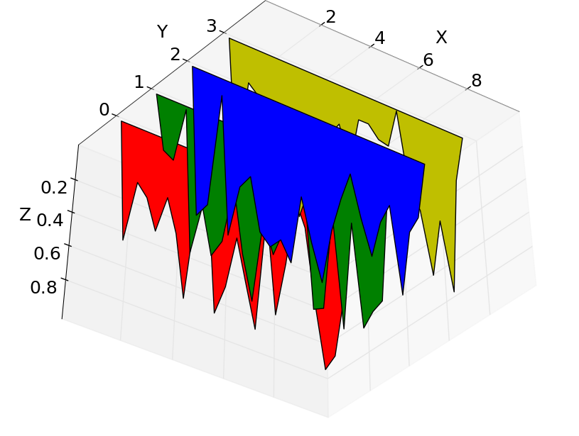
I’m posting it here especially so that the “matplotlib” people can have a look. For my data and just 24 polygons, I can find angles where about a third of the polygons are rendered out of order. For other angles, everything renders properly. If you happen to like one of the correct-rendering angles, you can use the output. If the angle you want happens to be in the other range of incorrect-rendering, context does not seem to matter; no matter which direction you come to that view, it still renders incorrectly.
Hi Wesley
I found your Blog when searchin Google for Dolphin Click train code. I have been recording Inia Geoffrensis (Amazon Pink Dolphin) and am beginning to suspect there may be more to their click trains than just biosonar. Your graphical representation may be a way to visualize patterns that indicate some sort of communication embedded in the clicktrains.
Thanks
Dave B
In an early test of dolphin communication, an experiment found that the way two dolphins separated by a visual barrier coordinated a response in order to get a food reward for both involved clicks, not whistles. Certainly, most of the ways that dolphins are described as vocalizing are based on click trains, not whistles. Part of my dissertation research determined a minimum bioenergetic cost of pressurizing the gas in the bony nares. That cost was lower for the pressure range usually used for click production than the higher pressures needed for whistles. So, yes, clicks are used for more than biosonar, and there’s a reason that should be the case.
I’m also thinking about using contour plotting as a visualization technique.
Do you need code for producing plots of your data? Right now, the script I used for the plots here is only slightly derived from the demo code from the Matplotlib site and hopelessly specific to this one set of data. I will be generalizing it for use on a bunch more click trains.
Nice post! I was looking for a long time how to do waterfall plots using matplotlib ;)
Did you submit the matplotlib visualization issue you found on the matplotlib mailing list?
I did get feedback from the Matplotlib email list. The ordering issue comes about because Matplotlib is a 2D graphics package, and the pseudo-3D functionality has to “guess” at what the ordering of 2D planes ought to be. This can be worked around by defining a PolyCollection for each plane and explicitly assigning the third dimension property value to each. You have to keep in mind the angle from which you want to view your set of planes when assigning those values.
So I was able to get a properly sorted graphic after all, which is included as a figure in the paper I recently noted here as published.
Pingback: Python:Waterfall plot python? – IT Sprite
Pingback: Waterfall plot python? – PythonCharm
Pingback: matlab – Waterfall plot python? – Tech Notes Help