More Plotting
I followed up on a comment left in the earlier comment thread about giving gnuplot a try. For some reason, I had difficulties getting it installed on the MacBook Pro, but I got past that hurdle and spent some time today working with gnuplot.
OK, for someone who has access to Matlab, what exactly is the attraction to command-line plotting tools like gri and gnuplot? It is precisely because these can be called as part of a batch process that I find them useful. In doing the work I do these days, I have replicates of runs. If I use an interactive tool, I’m going to be spending a lot of my time simply stepping through a process over and over. If I put in some effort up front, I can write myself some scripts to automate the process and let me spend more time in analysis or coding.
“gri” does permit the production of contour graphs pretty easily, but I was finding it a bit rough in trying to get a surface rendered instead. That’s kind of frustrating, because there are examples online that look like they are doing what I want to do. So I thought I would check to see whether it was any easier in “gnuplot”. As it turned out, it was.
gnuplot provides two basic graphing commands, “plot” and “splot”. “splot” is the feature of interest for me, and in gnuplot 4.0 and above, a further useful style of “pm3d” modifies that. I have to admit it took a while for me in playing around with gnuplot interactively to figure out exactly what had to be done. One of the big steps was putting the data in just the right format for gnuplot to handle. I could dump my xyz data into gri, and gri would figure it out for gridding. Not so with gnuplot. The xy coordinates have to be completely sorted. Further, gnuplot expects a blank line in between each column’s worth of xyz entries. Fortunately, there was a site online offering an awk script for adding those blank lines. A little extra work in my Perl script formatted x and y values with leading zeros so passing the file through “sort” gets it set for awk to do its thing.
Then there were the data points, irritatingly plotted with “+” symbols. It wasn’t at all clear to me that what I wanted in getting my surface plotted without distraction was to tell gnuplot to “unset surface”. The “pm3d” style handles the rest if I use “set pm3d at s”, which tells gnuplot that I want the color mapping of “pm3d” applied only at the surface. Other ways to specify pm3d action includes “bottom” and “top”. For myself, the “surface” option does fine on its own. Another thing I settled upon was using “set hidden3d”, which obscures parts of the projection that lie behind others.
gnuplot offers a large selection of “terminal” types, essentially how one wants the output to be presented. On Mac OS X, the “aqua” terminal is the default, putting a plot onscreen. For my batch processing, I can just “set term png” and I have output suited for figures in LaTeX via “pdflatex”.
I haven’t worked out all the labeling, but that will come soon enough, I think. Here’s a code snippet from my Perl script to output a gnuplot command file and launching gnuplot on it.
open(GPC,">${dataname}.gpc");
print GPC < < "EGPC";
#set term post
set pm3d at s
set pm3d scansautomatic flush begin noftriangles implicit corners2color mean
set palette positive nops_allcF maxcolors 0 gamma 1.5 color model RGB
set palette rgbformulae 7, 5, 15
set colorbox default
set term png transparent xffffff
set out "${resid}.gp.png"
unset surface
set hidden3d
splot '${resid}.grid.gp' w d
EGPC
close(GPC);
        # Call gnuplot
        $cmd = "gnuplot ${resid}.grid.gpc";
        system($cmd);
I make use of the Perl “here” document format, which makes it pretty simple to get Perl variable values into a block of text from another source. The funky command parameters were obtained by saving an interactive command session and using that to put together the script above; gnuplot came up with most of that.
Here’s an example output graph:
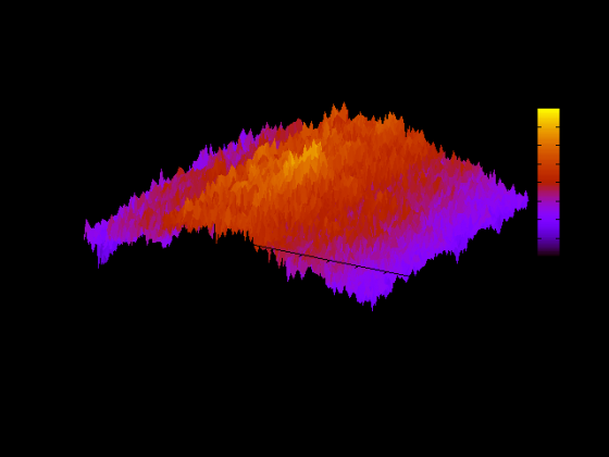
Obviously, transparency is better in some contexts than others. But basically I now have an alternative to firing up Matlab and interactively generating a color-mapped surface plot.
I use R or LaTeX (pgf package) to produce my figures. You can easily batch R and pass arguments via the Rscript command.
I may need to ask you for an example script or two…
Okay, I’ll send you the mkfigs.R file from the paper I just submitted.
I saw your long posting regarding Gnuplot, and thought you might be interested to know that there is now a book on it: “Gnuplot in Action”. You can pre-order it directly from the publisher: Manning: Gnuplot in Action.
The book has a section on scripting and batch-processing and chapters on multi-dimensional plotting and color management, including recommendations for optimal palette design.
If you want to learn more about the book and the author, check out my book page at Principal Value – Gnuplot in Action.
Let me know if you are interested in a review copy.